
TeachingCity is a collaborative initiative in Oshawa that brings together the City, Durham College, and other education and research partners to tackle urban challenges through innovation, applied research, and experiential learning. This project aimed to develop an accessible AR wayfinding experience for Ed Broadbent Park, enhancing visitor engagement through interactive navigation and real-time park information. The design prioritized accessibility, incorporating voice guidance, high-contrast visuals, and screen reader compatibility to ensure an inclusive and enriching experience for all visitors.
CITY OF OSHAWA
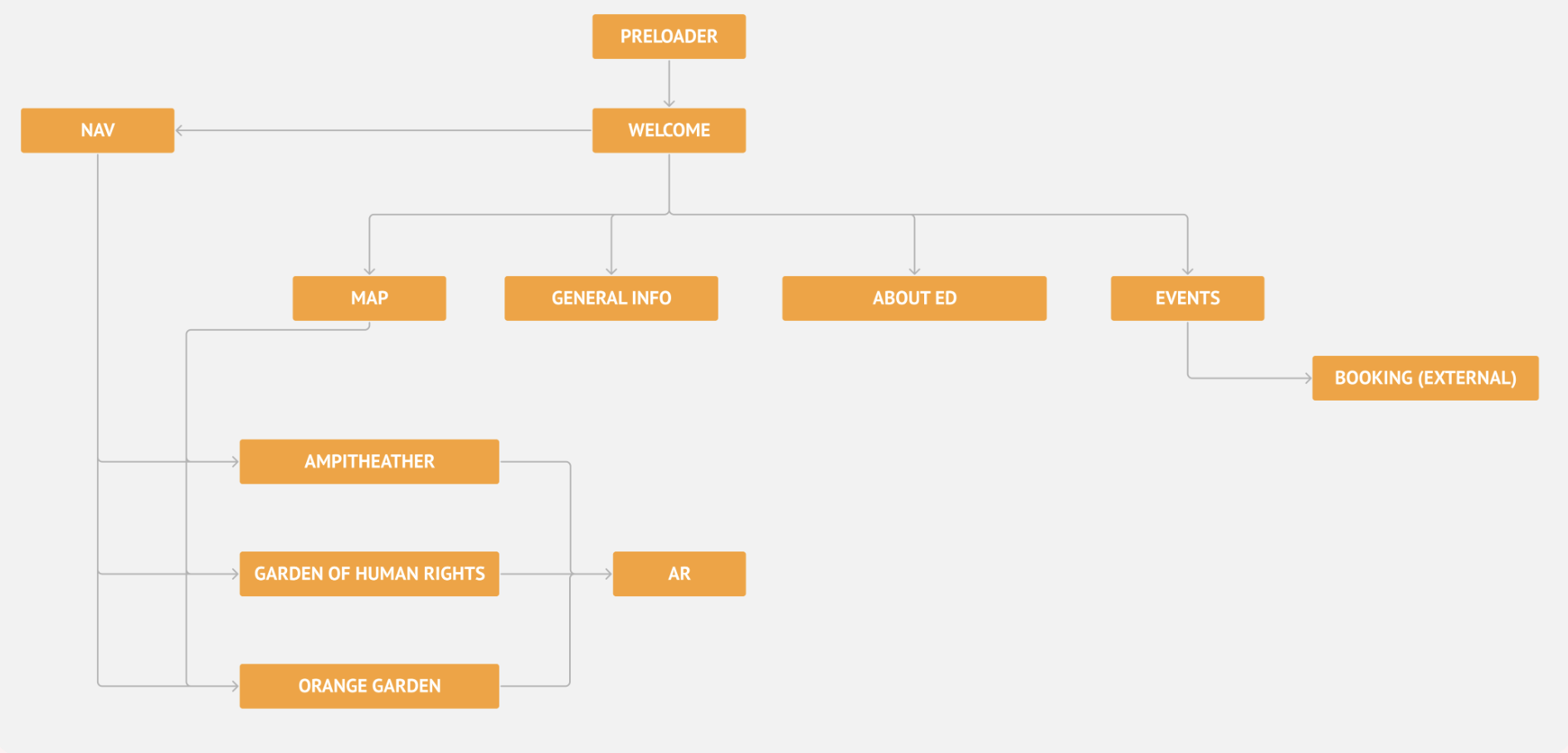
We mapped out the user journey and defined app functionalities to ensure a seamless and intuitive navigation experience. This process allowed us to pinpoint key user interactions, optimize the app’s functionality, and address potential pain points early on. During this stage, we also brainstormed essential design elements—such as color schemes, logo concepts, and typography—to shape the app’s visual identity.
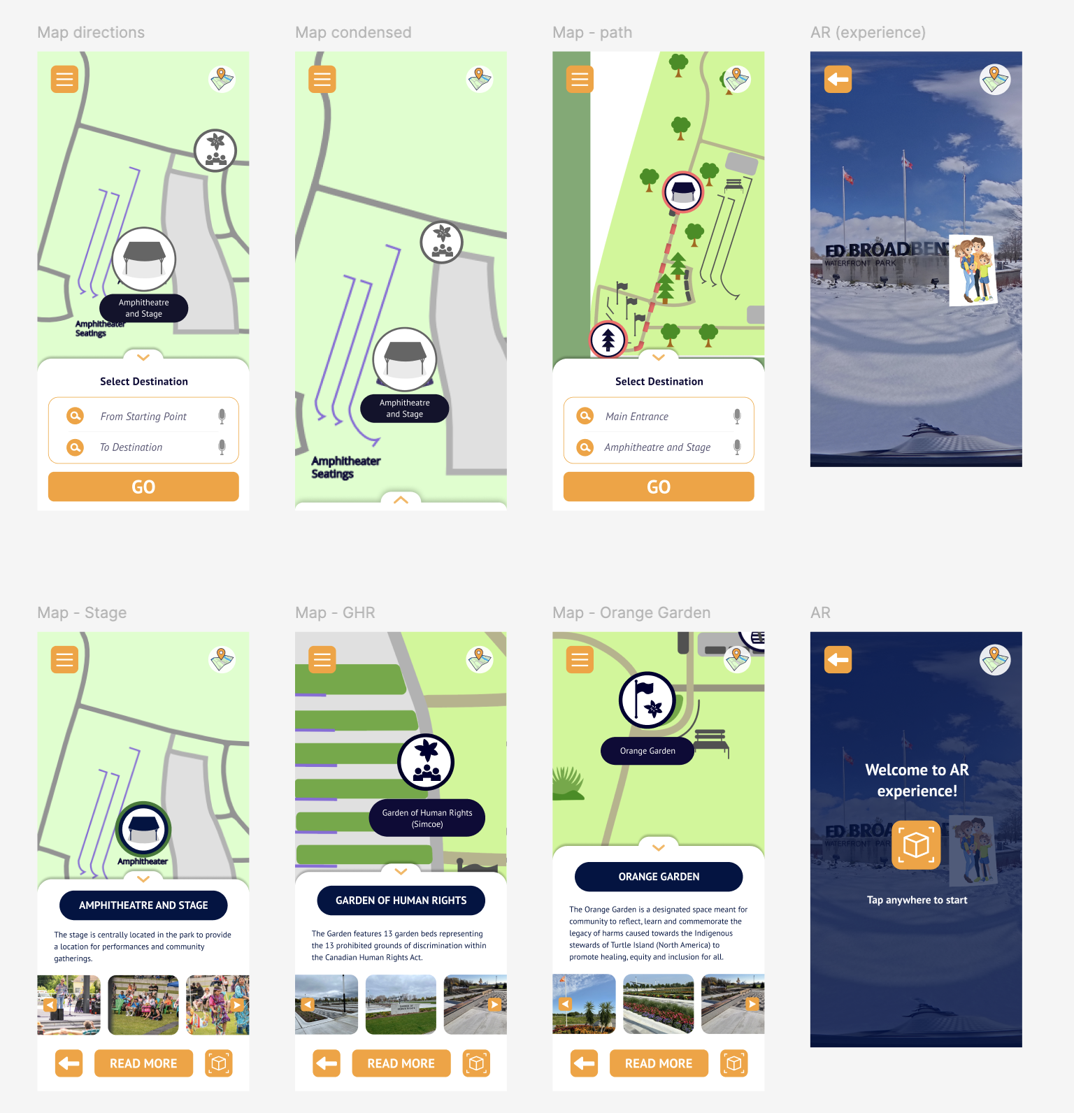
We designed a detailed map and developed an accessible wayfinding experience with a focus on simplicity and familiarity. To make navigation intuitive, we incorporated features inspired by commonly used apps like Uber and Google Maps, ensuring that users of all ages and abilities could easily interact with the interface. To enhance the experience further, we visited the park to capture 360-degree imagery, allowing users at home to explore the space virtually—as if they were physically there. The wayfinding experience was designed not only to guide users through the park but also to provide rich historical context at key points, creating an informative and immersive journey.
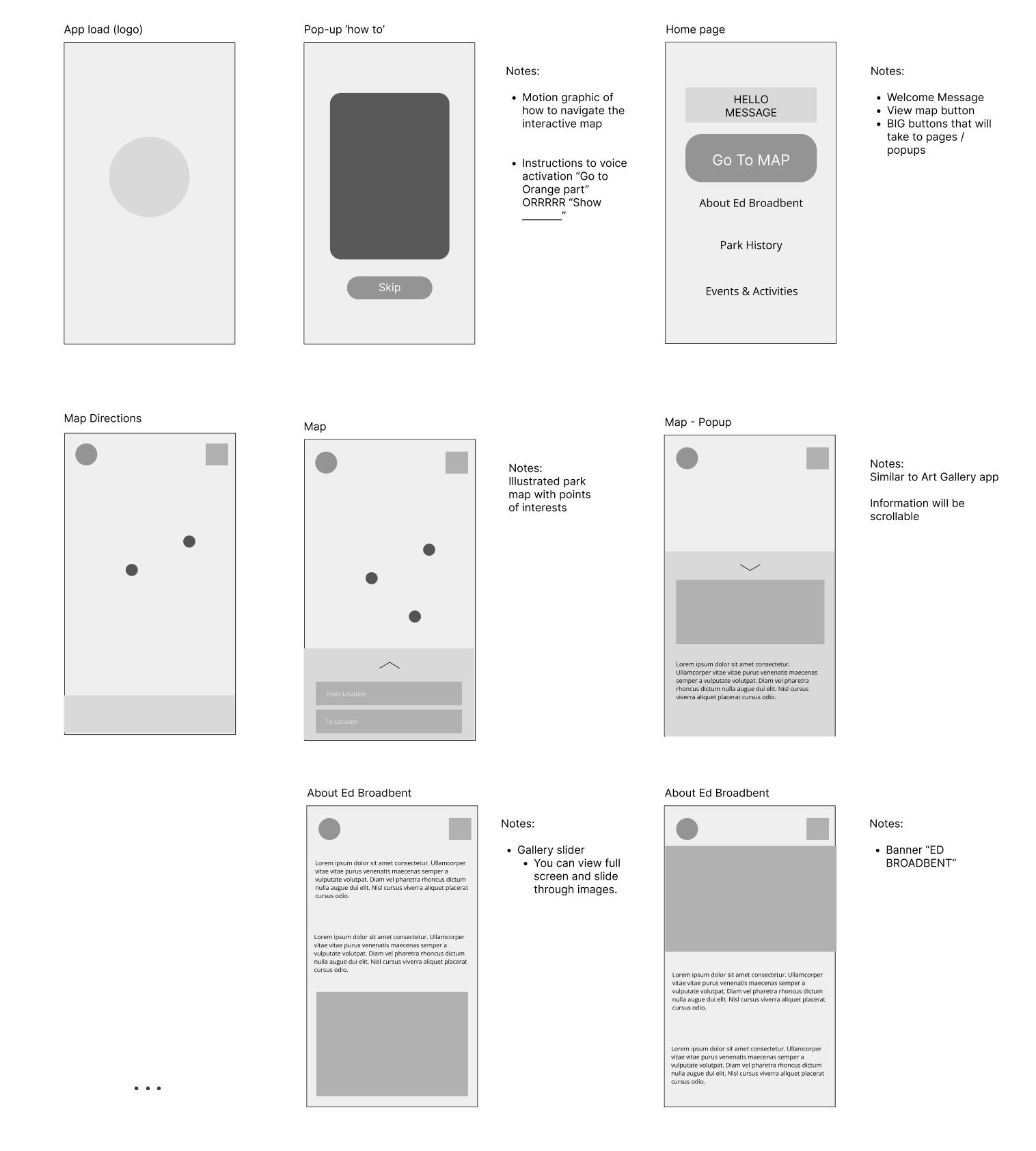
We developed low-fidelity wireframes to outline the app’s layout and core structure. These early designs emphasized the positioning of key elements and user interactions, enabling us to test and fine-tune the user flow before diving into detailed visuals. At this stage, we also began exploring logo concepts that captured the essence and purpose of the app, laying the foundation for its visual identity.
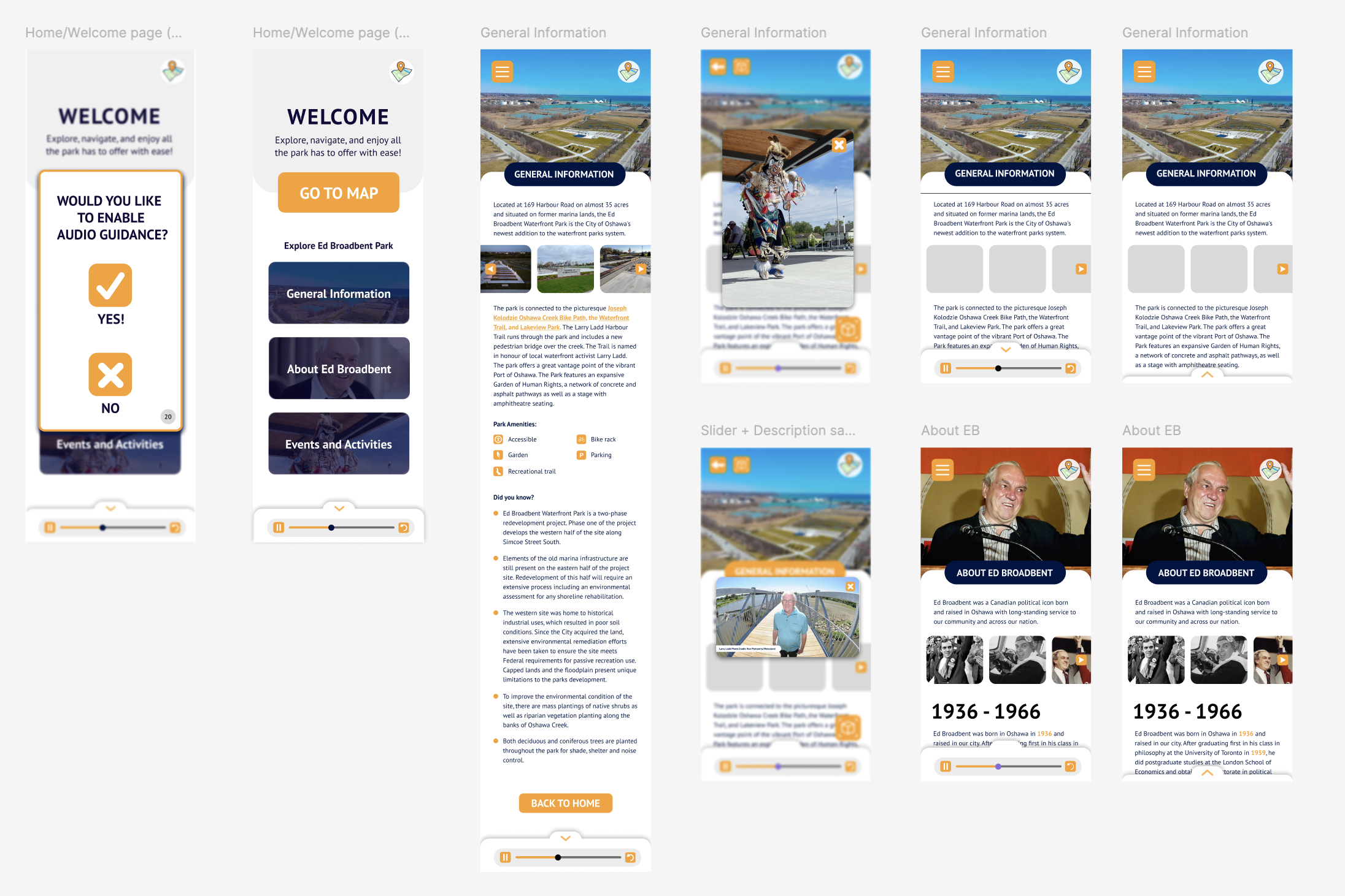
We created high-fidelity wireframes that incorporated detailed design elements such as color schemes, typography, and imagery, offering a realistic preview of the final user interface. This stage allowed us to fine-tune the visual design and maintain consistency across all screens. We also began collaborating closely with the web development team to align the design with technical requirements, ensuring a seamless integration between the front-end and back-end. These high-fidelity wireframes served as a comprehensive blueprint for development, helping to elevate the overall user experience.
Fill out the form below and I will respond within 24 to 48 hrs.